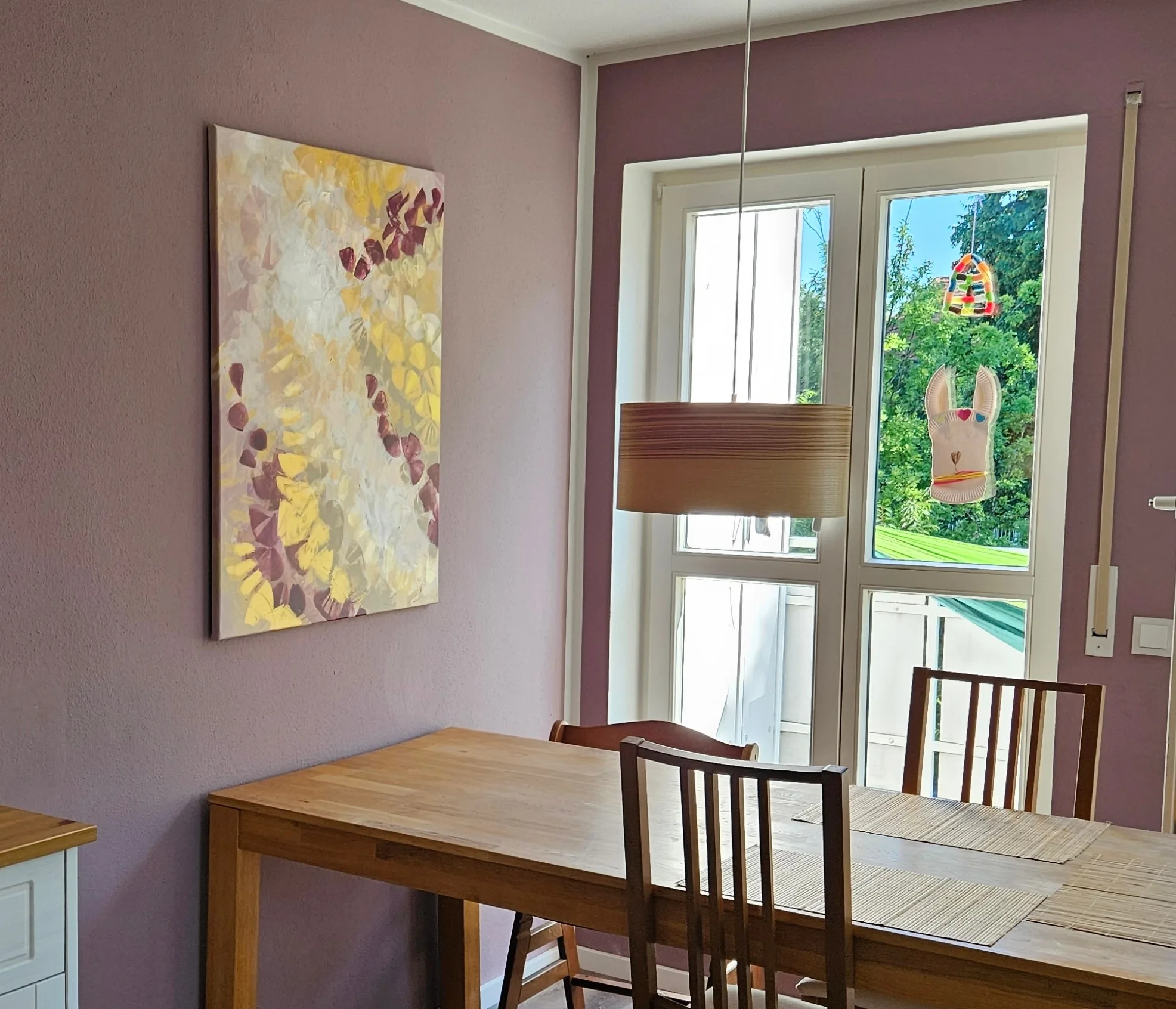
Golden Divine
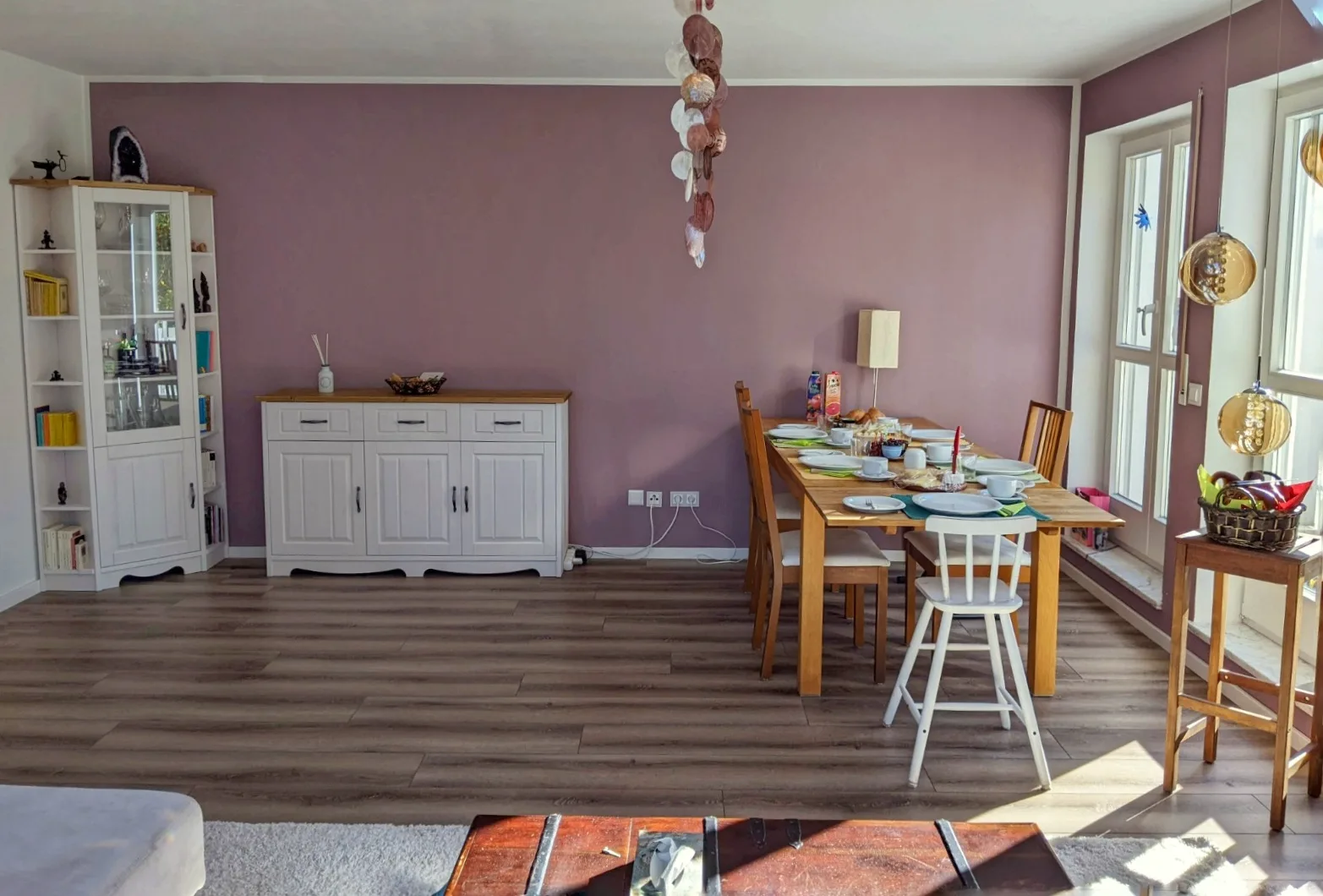
In the freshly painted living room with new furniture and lamps, only a picture is missing. But where should it hang: above the sideboard or above the dining table?
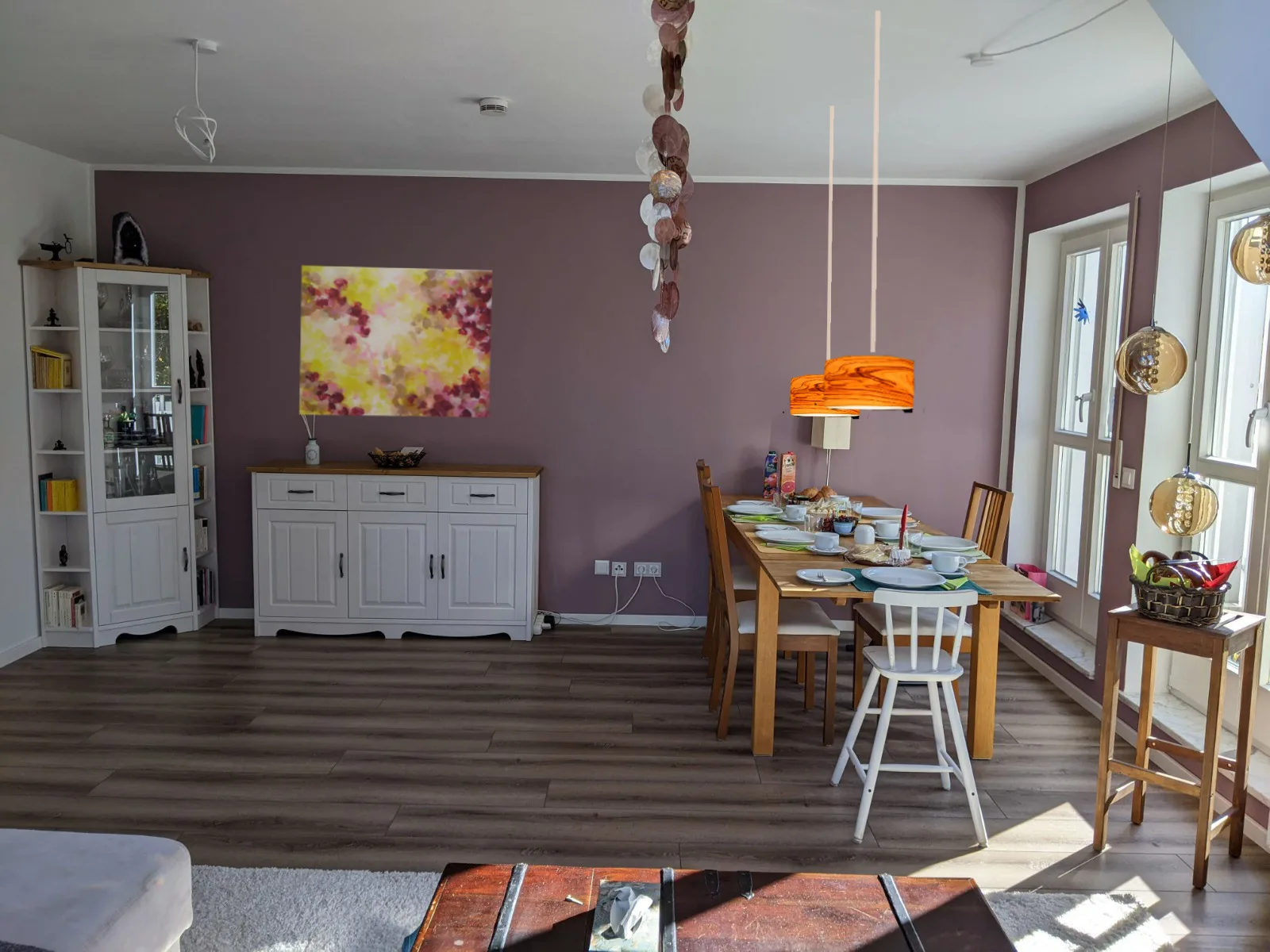
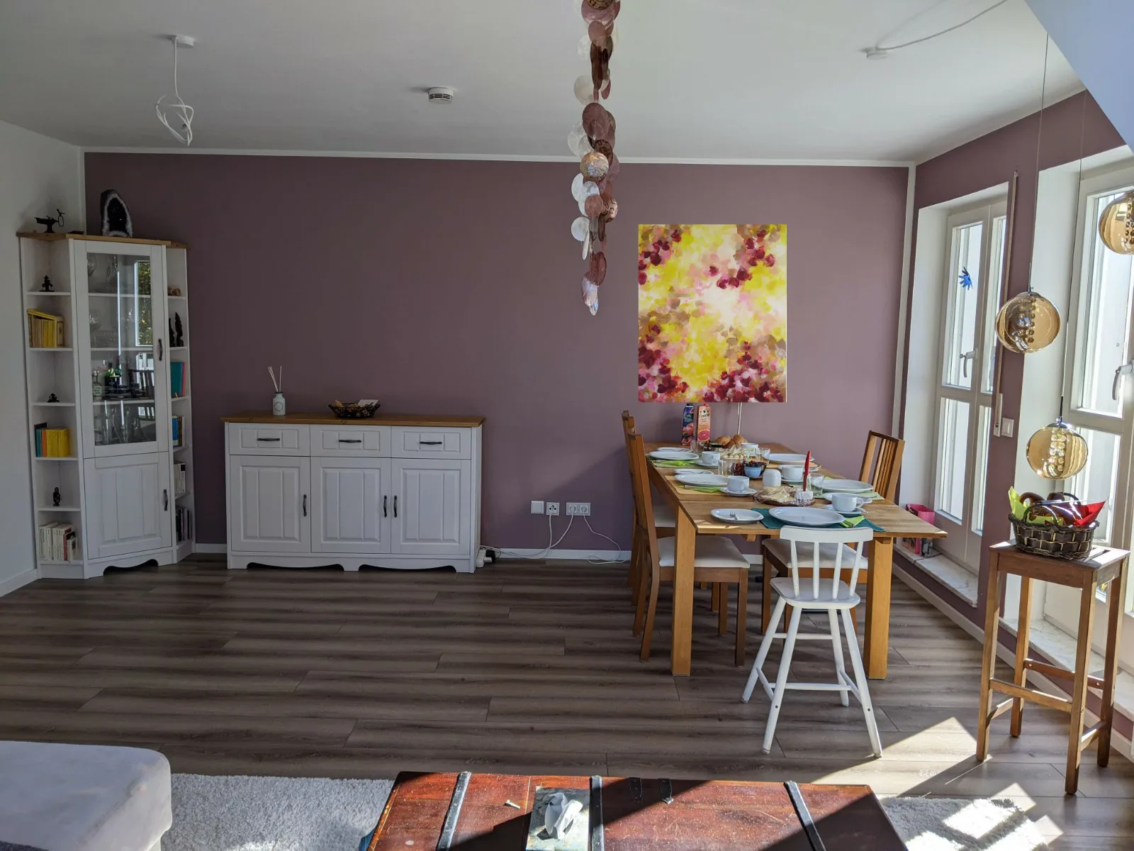
With the help of a few digital drafts we get closer to the decision and find that instead of yellow, the picture should rather contain beige, light brown and golden tones – colors that correspond better with the wood tones of the furniture.
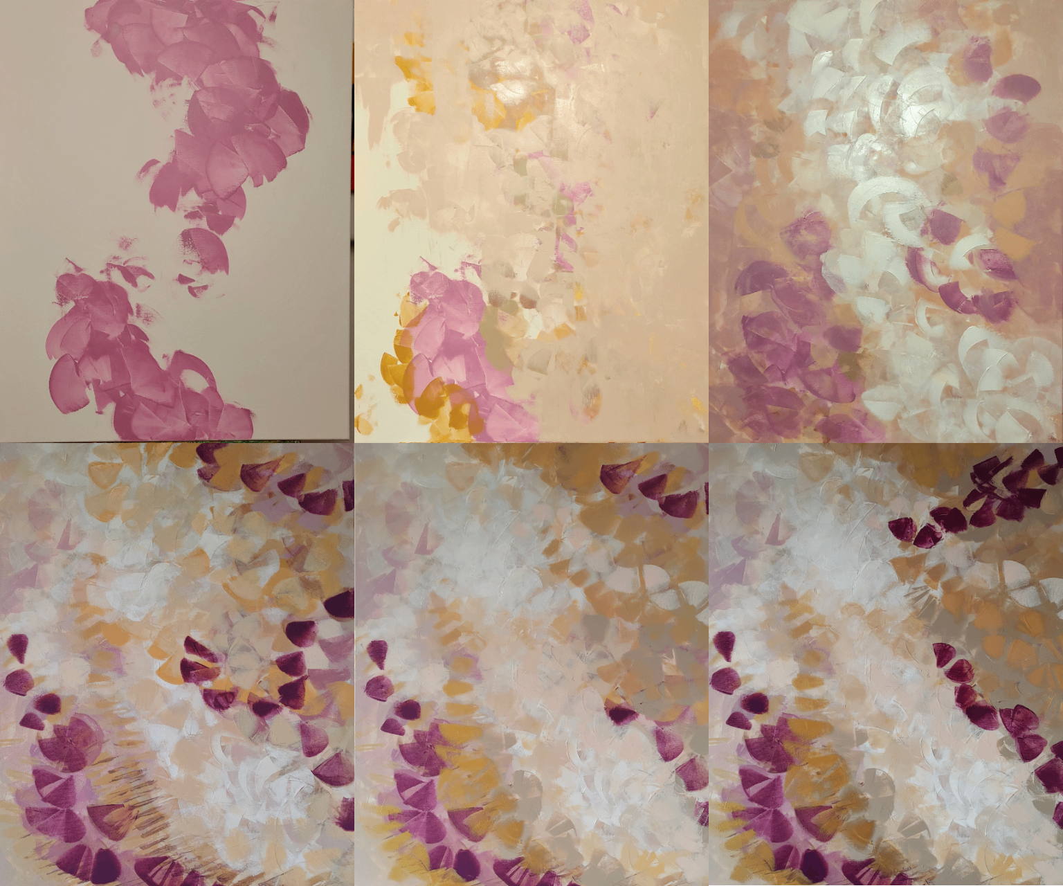
To say that it was clear from the very beginning what the picture should look like would be a lie. There was a rough idea and a direction, but such a picture evolves. I look at it again and again, and if it does not feel coherent in itself, it is not finished yet.
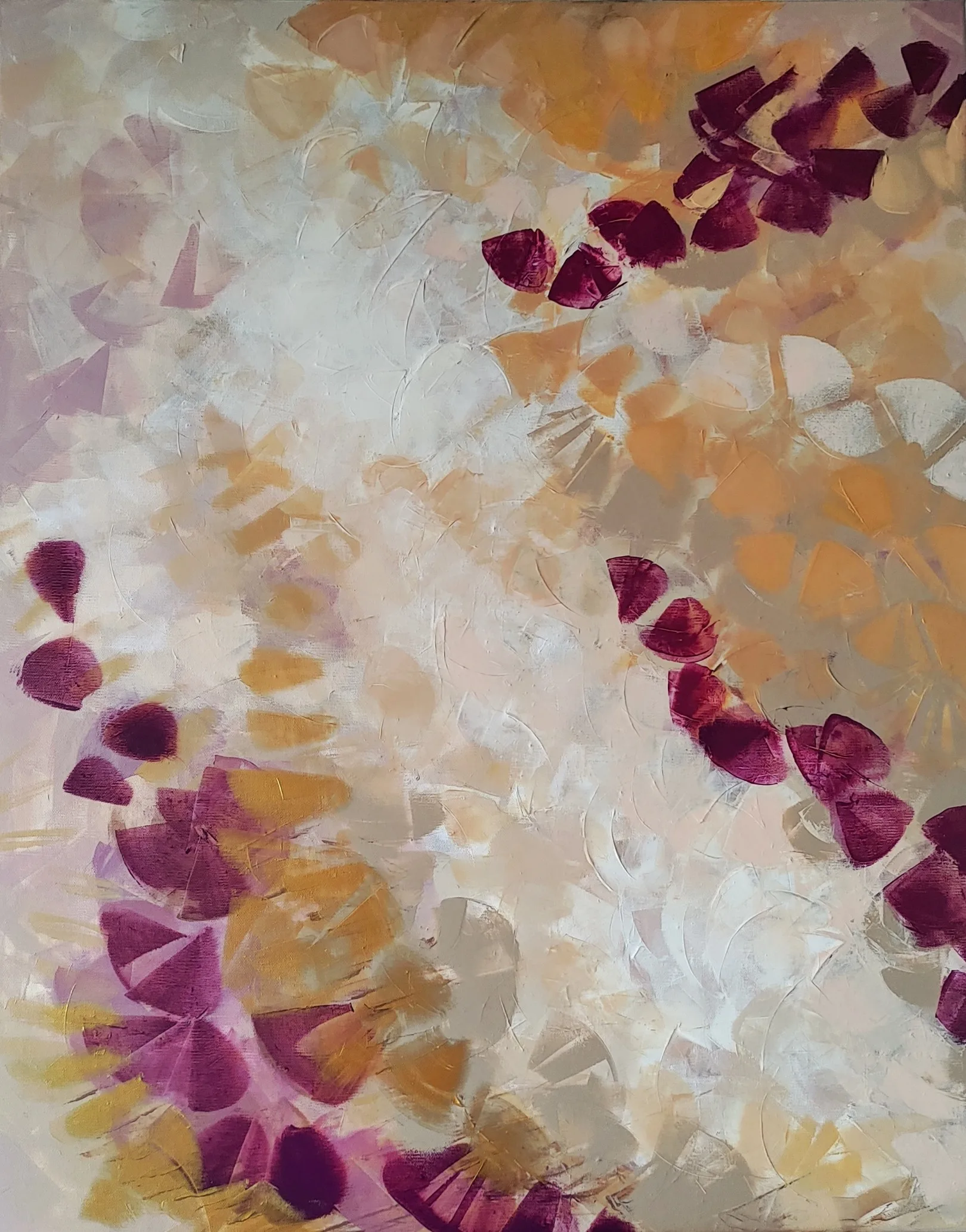
A sample of the wall paint helped to match the tones at the edge of the picture to the wall.
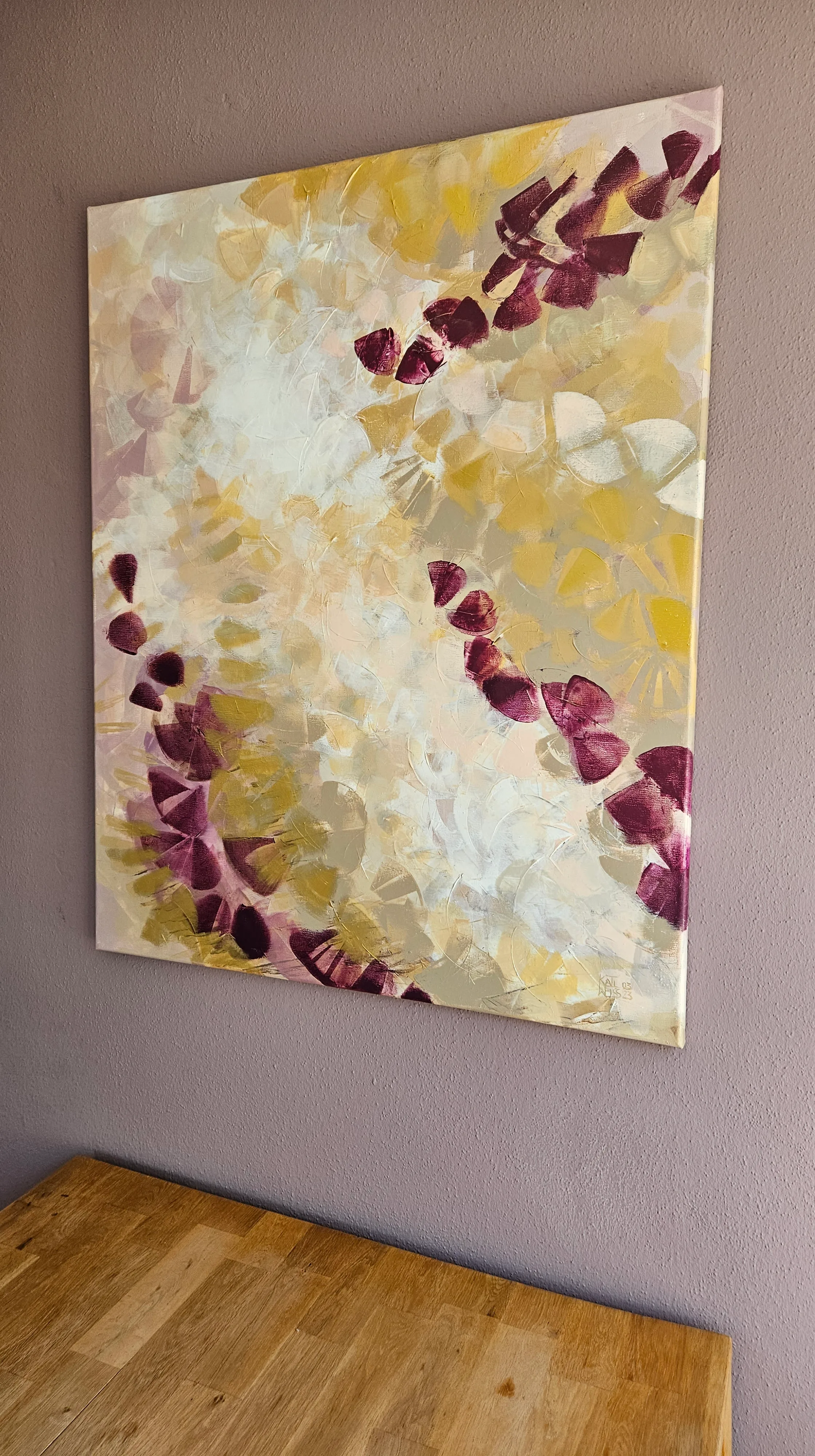
While painting, I kept imagining how the light would make different parts of the picture shine depending on the perspective, and I am glad to see that it worked.